As a left handed user... I fucking despise the idea of thumb-reach heatmaps geared solely towards right handed use.
As a side note, we make up ~10 percent of all users. If you design to the thumb reach of right handed users by default, you're fucking over a lot of people.
Add on that ~19 percent of the population has some form of disability, and a solid chunk of that involves hand/limb usages, making the head-up-ass assumption that a right handed thumb map is the "ideal" approach is... well you've shoved your head up your ass.
----
edit: I want to add, I'm not attacking you so much as the general premise of the article. I come off as fairly hostile on this since it's such a common day to day inconvenience for a broad swath of the population.
Aside: I discovered touching a navbar button often doesn't work for a left hander, whereas it does work for a right handed person.
This left vs right handed UX flaw occurred with the navbar button at top left on an iPhone (e.g. back or hamburger).
A left finger comes in at an angle that makes the capacitive touchscreen register the touch as occurring at the extreme left edge of the screen. A right index finger registers the touch more correctly within the navbar button. Some navbar buttons don't extend the touch hit area to the edge, so a left finger fails to click it, whereas a right finger works...
>As a left handed user... I fucking despise the idea of thumb-reach heatmaps geared solely towards right handed use.
Hold your horses!
Just use the left side of the keyboard as a toggle button...
when you click it once... the keyboard switches over to a left handed position and stays there until someone else switches it back to the right handed position!
As a right-handed user, I encounter trouble frequently when I grab my phone with my left hand, and find touches no longer register reliably. It seems right-focused is a reasonable default for a vast majority of the population, but there needs to be a way to alter to a left-focused scheme via settings or something. It is maddeningly frustrating when I occasionally realize, “Oh, fuck. It’s doing that stupid ignore-my-left-hand thing.” Were that happening constantly, because I’m left-handed, I’d be feeling pretty damn salty.
Wait.. which hand do you use? I'm right-handed but I use the phone with my left. (and it goes in my left pocket, because my car and house keys are in the right, per other comments).
But still, the thumbs are probably the least "handed" element of the body. I mix right and left thumb use based on whatever I need to be doing with my other hand.
An interesting thought, but there's some other factors at play. Navigating through views typically proceeds from left to right, which is why the back button is on the left side. I suppose you could change the direction of the animations, too. That seems unnatural in the context of a left-to-right language though.
Also left handed. I feel your hostility 100%. So many apps are subtly designed for right-handed people that I simply have grown accustomed to fumbling around with my right hand when using my phone.
Don't even get me started on various other items designed for right-handed people. Like this popcorn scooper I found at a nearby convenience store: http://a.co/jjanj7H I've even run in to butter spreading knives that are impossible to use left-handed.
Being left-handed is already a UX nightmare. Please don't make it worse.
Hi, I totally agree, the thumb reach map does show it as a right hand usage diagram, but the flipped view holds true for left handed users too. Also inn my proposed alternatives, I should have mentioned that the should have preference for left handed users to flip the diagram.
Right / left, or rtl/ltr is not flipping 180 or mirroring.
You want eventually the navbar mirrored, but you surely don’t want to read 321, 654, 987 on your number pad. Being lefty doesn’t make your brain read rtl.
Which no developer will actually implement. During the reign of touch scrollbars, before Apple obsoleted them, it was extremely rare to have an option to place them on the left side to avoid hand occlusion.
I had an Oppo F1S for a few weeks, it had a gesture whereby you could swipe and reduce the screen size to something like 60%[1] (guessing) thereby enabling one thumb reach.
My daily driver is an iPhone SE, I have average / medium sized hands and can reach the whole screen well enough.
Yes thats true, but did you try to do that gesture on a phone number dial screen? If you do that, it only shows numbers 1 to 9, rest gets hidden and is out of screen area. It would be nice if they managed to show all digits while the gesture brings the screen down.
Just get rid of the dialpad and let us use the keyboard to dial numbers. Google Keyboard already has a dialpad-style layout and you can choose to centre it or move it to the left or right thumbzone.
We already use the keyboard to type numbers and it works much better than a full screen dial pad.
wow, had to come here and figure out what the last part of this comment is (being read aloud) was like "what is up with this long delay between numbers/underscore) hmm
To me, none of these seems like a real improvement, and they all have drawbacks.
Part of the reason the current layout works is because it is well chunked. You have 123 on top, 456 in the middle, and 789 on the bottom. 0 and functional keys, which often serve their own purpose, get their own row. Four sets of three, nicely like the way our minds like to remember numerals and sets of numerals. Shape-wise, 1-9 are in a square, in numerical order from left to right just like a paragraph, then the others continue the pattern to a lesser extent. This creates a very easy and forgiving mental map because it is a simple shape, the full width (more or less) of the display or device, with a familiar pattern.
In contrast, 4 of these designs have different numbers of numbers on each row, some with several different widths. You'd have to remember, was it three numbers in the first row, or two? How many in the second? Was that one with an extra button on the side?
So to start these designs don't seem to consider why the original design is successful.
Next they don't seem to include the context of the thumb thing. We often hold our phone in one hand because precision is not required for most apps, for example Instagram where all functionality is within that bottom easy zone. But other apps require precision, many games for instance, and it's likely people change their grip frequently for those contexts. Is there data on that specifically? Anecdotally I seem to remember most people I know holding with one hand and dialing with the other. So the reach of the thumb isn't as big a consideration as the designers might think.
And as others have pointed out it won't save much time, since hardly anyone uses the dialpad except the occasional adding of a contact or dialing of a conference line.
I don't mean to rag on this (rereading, I sounded more critical than I am), I think it's fun to try to redesign stuff. But it reminds me of when people try to remake the ordinary wall outlet. They start modifying it without really considering how deceptively well designed it is.
Every single one of these alternative layouts is a load of hot garbage. The reason the current layout is good is because it's good enough and familiar. If you have a problem with thumb reach then make the pad smaller, move it closer to the thumb, or make it easier for people to input the number through other methods than keypad.
We can recognize QR codes, heck, even do AR on a phone. Surely identifying phone numbers via the camera and inputting them that way would be easy and a measurable improvement over the current method of mashing buttons.
Since dialing a number by hand is such an infrequent operation, inventing some wonkball new standard for it is a super bad plan. There's a lot of other things you could innovate on and come up with real improvements, like how you might make a better audio playback control system, or re-visiting mixing tools (equalizer, cross-fader, effects filters) for music to make them easier to understand on an intuitive level.
> Surely identifying phone numbers via the camera and inputting them that way would be easy and a measurable improvement over the current method of mashing buttons.
Not many people really dial phone numbers these days though - dialing via contacts, history, a link on a website or Google Maps are far more common in my experience.
The issue is already pretty much solved without the need for any OCR - of course Google Goggles does do that too if you need it.
Not really. What if there's an emergency and someone's trying to dial a number but, due to mitigating circumstances, are having trouble using your crazypants dial pad?
What if, worse, they're only familar with your pad and are confronted with an actual phone that uses a totally different system?
What if this isn't a dial pad, but an interface for a car or heavy equipment? What if, in a moment of panic, someone's muscle memory kicks in and they do what they've always done to avoid disaster, only in your system it does the opposite?
Switching from rotary dial to a dial pad was a big deal, and whatever system they chose for the dial pad out of all those kooky options would be the standard. If they had them in random order for whatever reason, then leave it alone.
I see this all the time when people think they're "helping" by showing a keyboard in alphabetical order. No, not helping.
It used to be that every single country would have one or more power plug types. Over the years some have faded out, sometimes reluctantly, sometimes stubbornly, but having fewer standards is almost always better.
The long-tail of UX is misunderstood indeed. Just because you can redesign something doesn't mean you should.
>What if there's an emergency and someone's trying to dial a number but, due to mitigating circumstances, are having trouble using your crazypants dial pad?
What if they're handicapped, and only have one finger and the new layout allows them to dial faster? The current design would have failed them. Every design works within the constraints that are given. Creating cases where a particular design works/doesn't work isn't hard or interesting, unless you actually do something about it (which is what this article is proposing).
>The long-tail of UX is misunderstood indeed.
Then I would invite you to study it some more.
>Just because you can redesign something doesn't mean you should.
No reading of what I said, or the linked article has anything even remotely close to suggesting that. Maybe you could have asked for clarification since your reply seems very confused to me.
I am very much a UX enthusiast if not long-time student of that field. I am a constant proponent for usability features.
These patently awful dial pads help nobody but the authors of the blog post fishing for clicks. They're junk. They're worse than useless.
Apple made a "one handed keyboard" for iOS 11 (http://appleinsider.com/articles/17/09/21/inside-ios-11-appl...) and it shows how it can be done. They scrunched it down a bit to make it more convenient to use. They did not arbitrarily rearrange everything into an unfamiliar layout and force that layout on everyone who wanted to use that feature.
Another example is the Matias "half" keyboard (http://matias.ca/halfkeyboard/) which comes in two varieties: Minimal and full-sized. Both offer similar features and are intended to be used with one hand. Note they didn't jumble up the keys, either, they made it as conventional and familiar as possible while still achieving usability goals.
Design that can't stand up to honest scrutiny isn't good design IMO. If you feel this isn't honest scrutiny, then that is a separate issue than saying one shouldn't work on established UX paradigms.
We get stuck with common ways of doing things, sometimes for good reasons, or sometimes for no-good reasons. An occasional re-think is useful, even if its just a mental exercise. As you mention there is a lot of inertia with this one, but they're not plotting to take your favorite dial-pad layout away from you anytime soon :)
I'll agree with you on the precision issue, as these designs would seem to need greater precision to hit the correct button, even if only by a few degrees.
However, the consistency of rows I think only makes sense with physical buttons where you can feel your way across them. With a flat panel, we don't really have the feedback anyway, so you can't touch your way down to the next row and know where you are.
Having said all that, I'm not a fan of these designs, but I am a fan of the designer taking on the challenge.
sure. its like saying the qwerty keyboard is well chunked and can't be improved on... the point is to improve ergonomics and can be improved depending on how the user holds the phone.
One of the concept mockups says patent pending. If the author is attempting to patent this I can see why he wants to re-open the established standard, but there isn't much value in changing how the buttons are arranged. And frankly, if he's trying to patent this button layout, it doesn't matter if it's any better because it will never be used due to the patent.
The future is more likely dialing by voice than it is a re-arranged button layout.
I agree re: the patent pending and their trying to drum up some sort of support.
My opinion, what a monumental waste of time. I'm damn happy that I read tbgvi's comment before looking at the article, as the few minutes I spent browsing over it seem a waste.
What's next, let's design coat buttons to allow people to get dressed 0.5 seconds faster(after of course speeding hours relearning their muscle memory to actually do it -and don't forget the patented new button design giving them 20% of all sales of course)
Dialing by voice? Surely the future is not dialing at all?
I can't remember the last time I used a phone number for anything. Contacting friends is mostly done via social media. Talking on the phone is done via voice or video via same social media. Contacting companies? Via e-mail or their own webpage with some kind of chat support.
I only have a phone number, so that people without smart phones (my grandmother) can contact me.
> I can't remember the last time I used a phone number for anything.
Daily.
> Contacting friends is mostly done via social media. Talking on the phone is done via voice or video via same social media.
My friends aren't reliably on social media (and some of them aren't at all). SMS is quickest for small things, an actual phone call is quickest for a slightly longer discussion. E-mail for a group discussion or long-term planning.
> Contacting companies? Via e-mail or their own webpage with some kind of chat support.
I start with their online help or ordering system. For a tech company, e-mail might be the next option. For food, or something where I'm contacting someone local, it's almost always a phone call.
I'd have to think about the last time I actually dialed a number by hand, though.
Other than my work (which happens to be related to telephony apps) I rarely use the dialpad.
If I meet a new person I enter 10 digits and that is the extent of my usage. Not to say that the design in use is justified by limited use, but my point is that dialing a number is already antiquated. Most of the time I dial something from a saved/shared contact, maps, or from a link in an email or on a website - never actually typing in a number.
I find testing new user experiences for something as established as a dial pad to be interesting. This post mostly talks about changing the design for the dial pad to put more buttons within thumb reach, without going into many of the additional challenges.
For example, as others commented, many users primarily 'dial' their smartphone nowadays by tapping on somebody's face or going through their contact information. The cost of changing the experience may not be worth the added benefit. Along those same lines, it may well be that most dial pad users are not the owner of the phone, but somebody who borrows it to make a call or enter their own info. In that case, the experience should be familiar to them, regardless of whether the user has grown accustomed to a new dial pad. These are the kinds of factors I'd like to see discussed in researching a new dial pad experience.
Resistance to change on something like this is real. In developing a web-based phone app, people who were using computers, with keyboards, would still prefer to click on the buttons in the style of a traditional dial pad. To me, investigating those challenges are much more interesting than "Here are some designs; let's see which you say you like."
Whenever I am going to call someone, I use the dial pad but I start to type their name instead of their phone number. I feel like that is also pretty common so I wouldn't say this is something where the costs would outweigh the benefits.
Good point, even if I don't have them in my contact book with a name I still likely have called them previously, so I used the recent caller list and scroll + click on the number I recognize.
I wouldn't say dialing a new number is a common use case for me. But that doesn't mean people don't do it often enough to warrant research.
These generic "solved" UX issues are still things that millions of people do each day, given a billion phones, so it's well worth a modern UX study IMO.
This missing element of that analysis is that in the smartphone era you almost never type out a phone number. You were texted it and click on it, see it on the web and click on it, found the company on Google maps and click on it...
The dial-pad may be too difficult to reach on our big screens now, but the momentum required to change it will never exist because it simply doesn't get enough use to be a pain point anymore.
Excellent write up and use of graphics though. The Bell labs part was really interesting.
Phone numbers are also entered into contacts and other places with the number pad keyboard. The numpad keyboard works better on bigger screens than the full dial pad since it occupies bottom of screen.
Replacing the dial pad with the numpad keyboard would solve the problem and not require custom layout. It would also be more consistent across applications that do calls instead of having a special dial pad for the phone app.
> So Bell System decided to conduct their own research, and after testing many different layouts, decided to choose the one that we all use now.
The article glosses over the fact that the layout we use now was not not the best in the Bell study. As you can see from the image in the article [1] the traditional circular layout was the only one that had both significantly shorter keying time and significantly lower error rate. The other source they link to [2] says that "Performance and preference differences, though, were deemed to be fairly small overall across the five finalists, so for engineering reasons Bell went with the layout we know today."
> As you can see from the image in the article the traditional circular layout was the only one that had both significantly shorter keying time and significantly lower error rate.
The image in the article shows nothing of the kind, as you might notice if you ask "lower than what?" On your analysis, layout IV-A had a "significantly shorter keying time" than layout VI-A, but that's nonsense -- those are the same layout.
The answer is that "significantly lower error rate" and "significantly shorter keying time" refer to statistics taken within a comparison group of three layouts, and don't apply to comparisons between a layout from one group and another layout (or the same layout!) from a different group.
> The image in the article shows nothing of the kind,
You are right in that the comparison was only between the group of three layouts in a row. From the image no conclusion about the performance of the layouts in different rows can be drawn.
However, in the same study, they did a direct comparison between the grid and and the circular layouts and here are the numbers:
                             KEYING TIME  PER CENT
                              (SECONDS)    ERRORS
    THREE-BY-THREE PLUS ONE    6.01         2.5
    TELEPHONE                  5.90         2.0
    SPEEDOMETER                5.97         3.0
The study concludes that the differences are not significant. So my point still stands: The grid was not chosen because of superiority in the human factors study but because, in the words of the study: "the rectangular arrangements [..] offered certain engineering advantages".
It always seems odd to me that people want to readdress solved problems. When I mean solved in this case I mean reached a level of usability where the design became stable, then familiar, then standard/de jure.
The oppprtunities for improvement here are minuscule, and nonexistent if you take into account familiarity and expectation. We should save this kind of blue sky redesign for new or less solved design problems and stop making people’s experience worse in pursuit of some noble but misguided strive for constant and relentless disruption.
Why not simply shrink the dial pad back down to iPhone 4 size and put it in the thumb zone? Is there a reason it needs to take up the whole screen? Sure it will look a bit weird, but the ergonomics would be a win.
I would probably still center it though, since we don't know which hand is holding the phone.
>So, looking at the image, one may question — Why did the Push Button phones changed the dial button positions from a circular arrangement to a different layout?
Because the "register a number as dialed" mechanism was different, and didn't require people moving their fingers in a circular motion -- so they've made the buttons equidistant.
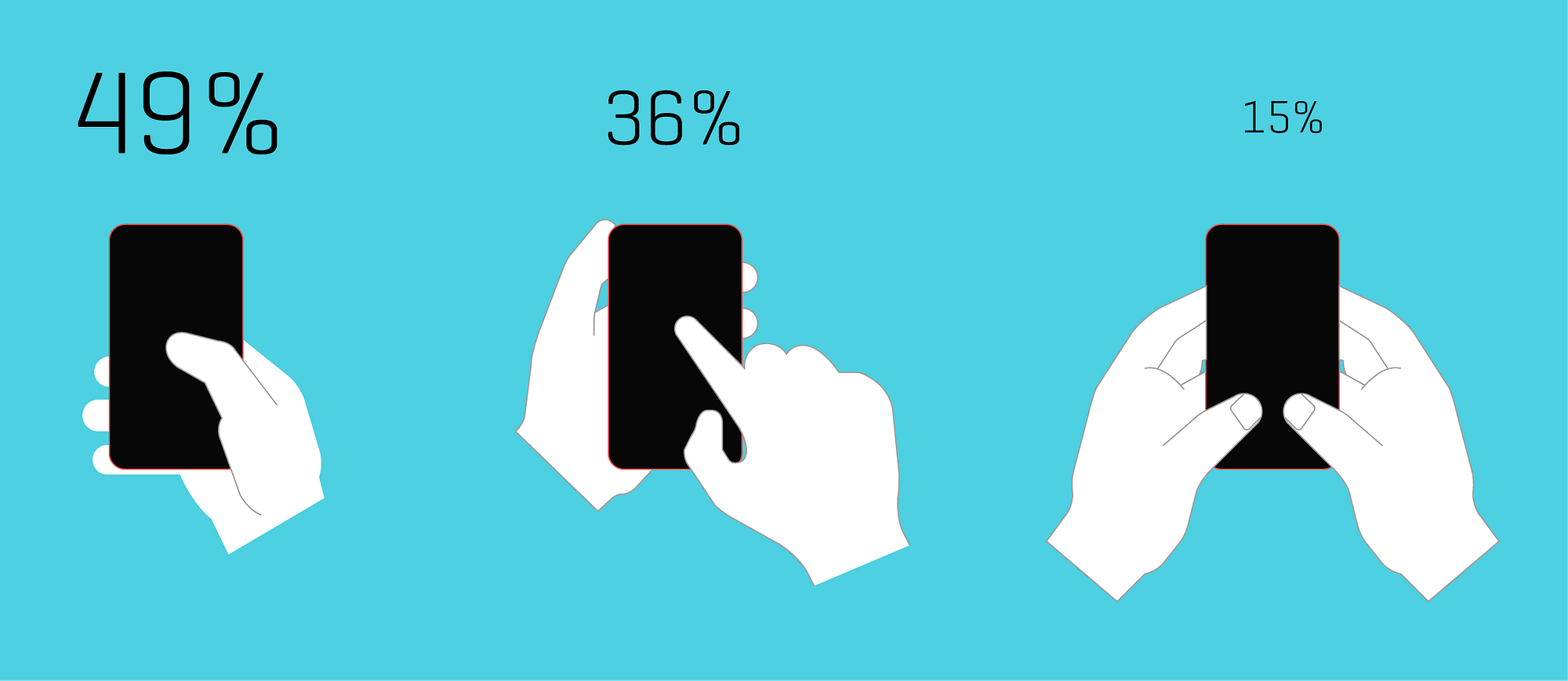
>He suggests that most of us hold the phone from the bottom such that the base of our thumb is at the bottom right of the screen (considering 90% of population is right handed).
49% is not most of us -- most of us use something else (according to the diagram). It's just the way with the most users, not the way most people use (subtle difference: the other 2 popular ways amount for 51% of users).
What's more important, the other 2 ways are not some outliers, or severely fragmented styles, but 2 holding styles will major followings. So those should be catered too as well.
Cool idea but I'm kinda baffled by the new designs. The writer presents the thumb reach diagrams, but then the none of the new designs seem to conform to the very clear curve of those diagrams?
I feel like the "how people hold the phone" study is sort of flawed - people probably hold it in each of these positions at different times.
One-handed: clicking audio controls, scrolling through news or similar content
One hand holding, one hand tapping: more precise input of things like phone numbers, browsing web pages, etc.
Two hands holding: typing long messages, some games.
Maybe it's because I have a larger phone (5.5"), but I wouldn't do any input task more than a single button press or scroll using my thumb. I always bust out the other hand for that.
I'd take it one step further and just say to hell with phone numbers. It's about time we can just "resolve" names into devices. With URIs or something prettier.
I know I'm overlooking existing infrastructure and countries with fewer smartphones but we need to leave this behind at some point.
You mean like how DNS works, where a _unique_ name resolves to a _unique_ address?
Without each side being unique, how would voice://John_Smith-00003475 be better than a phone number? We already have address abstraction in the form of contact avatars on our phones. Click John's face, then talk. And since this is done locally, I know that a wrong number is just my fault and easy to fix. Choose any reason why a central or even distributed resolution contains an error and suddenly you're back to keying phone numbers just to make a call while we wait for corrections to be issued by, whom, exactly? My parents don't even know the difference between a cellular connection and a WiFi connection on their phones, are they supposed to be responsible for their own online contact records too?
Well, just as yahoo or gmail do it. Even 'bigjohnfromcanada' or something equally silly, but unique, is easier to remember than 10 or more digits. The other challenges mentioned exist...but dns has served us well, and naptr records already exist..m
When do you even need to type a phone number anymore? For me it's only in cases when I'm reading it from a website or such, where my phone should be able to read the number from the camera. So maybe the most important ux aspect would be adding some OCR.
The article talks about something I'm curious about: which hand you hold your phone with and which hand you tap with.
I'm more or less right-handed - fairly ambidextrous for many things - but I write with my right hand.
I always hold a phone or similar device with my left hand and tap on it with my right hand, like the middle example in the three illustrations on the blue background midway through the article (the one that it says 36% of users do it this way).
It never once occurred to me to hold a phone with my right hand and tap on it with my right thumb, like the leftmost illustration in that image (49% of users).
If I do tap with my thumb, I still have the phone in my left hand and use my left thumb.
I think this comes from my earlier days with pads of paper and a pen or pencil. I wanted to write with my right hand, so naturally I held the pad in my left hand and the pen in my right hand.
Of course I've always assumed everyone does it this way: hold the device in your non-dominant hand and tap on it (or write/draw on it with a stylus) with the dominant hand.
It's a total surprise to me that people would actually hold a phone or device with their dominant hand. I guess it makes sense if you're always using it in a one-handed manner, but for me it is just something that never even came to mind as something to try. Since I'm holding it in my left hand anyway, if I do use a thumb it will be my left thumb.
Not saying one way or the other is right or wrong, of course. I wonder if this is one of those things where people fall into one of two (or more) groups, and don't even know the other groups exist?
This just sort of seems like DVORAK layouts to me. A possibility that it MAY be more efficient, just not enough increase in efficiency to make it ever worth it to change, especially in a world where there is no real evidence its actually more efficient.
Also I find that doing standard dialing is pretty rare these days, and so low mental load, that I think I wasted more brain cycles reading this than I have ever just dialing a number.
Maybe I missed something, but it seems like measuring the winner based on average time of the first couple of samples is significantly flawed. This is equivalent to me putting you in front of a keyboard with a normal layout, and then a layout where the keys are scrambled and asking me to type a sentence, and then measuring success by average WPM on all attempts. ... ofCOURSE i'm going to be slower on the different layouts regardless on my first, second, third, maybe even hundredth use. But 2 months down the road the benefits may start rolling in.
It seems to be that a better way to measure results would be to create an Android only app (iOS doesn't support swapping primary dialer). and getting participants to use your dialer for a couple months, once you notice a new baseline per user compare results between the various treatments.
Tl;dr unless I missed something! these results aren't going to prove anything, other than familiarity rules.
All that aside -- I LOVE this! In the spirit of experimenting and trying to improve on a very old concept, and creating an app to whip up some quick results, very, very cool!
Though I echo the sentiment about most phone number input is not done by using the dial pad, there is still need to have a dial pad -- especially to interact with IVR systems.
The telephone dial pad is as familiar as the QWERTY keyboard, and attempting to change that -- especially for something that people use less than ever -- seems futile to me. That said, the underlying point of increasing screen sizes leading to hard-to-reach dial pads is valid.
What I'm missing though is that to me there's a painfully obvious solution: make the existing dial pad smaller. Nothing says it has to take up the entire physical screen space. Take the existing, familiar layout, and resize and reposition it to be within the "natural thumb arc" area. This does mean different size screens need different layouts, but that seems like a trivial detail.
Yeah, a simple solution on iPhone is to just get rid of the full height "dial" circle icon and make it a flat button, and shift the whole view down towards the bottom of the screen.
Most of my dailing is done via voice, phone URL or stored contact.
Most of my time in dialpad is spent entering digits for automated systems (e.g. "press 1 to join meeting" or "dial meeting code then #" or "press 0 to talk to a receptionist").
Great point about automated systems. Now I'm imagining a future where there's better telecom integration so that the phone tree options are integrated into the caller's UI.
For example, speaking to your cell phone company, you could see:
That sounds like it'd require a huge overhaul to the phone system. At which point... why do the telcos even need to be involved here? VoIP is common enough now that you could just have a menu system before the call and trigger a VoIP call to the right department automatically.
And heck, let's get rid of phone queues while we're at it - just have the agent trigger a callback rather than making them listen to an awful hold music loop for potentially upwards of 15 minutes.
The Bell System work strikes me as very valuable, in that a) they had a big opportunity to make a lasting, universal change, and b) the number keypad was a very frequently used element.
Here, though, I'm very suspicious. I worry that this is in the same category as the designers who come up with yet another novel way of making a hotel shower work. Is it really better? Probably not. And if it were, it's still different than every other shower out there, meaning that most people are very unlikely to gain the level of proficiency at which the benefits would kick in.
Pre-smartphone, I used the dial pad a lot, from 3 to dozens of times per day. Now, I might use it a few times per week. So is it really worth the effort to rework all these interfaces and retrain everybody? I'm skeptical.
I'd be soooo happy though if phones and keyboard numpads had the same layout (rather than being inverted horizontally. No preference for either, just want them to be the same.)
Honestly, as an Android user, I'd be happy with a Dialer app that doesn't crash, isn't slow to start up, and that, while in a call, actually generates DTMF signals of a useful minimum length instead of only during the instant my finger strikes the buttons. Hard-to-reach buttons is the least of my problems with Dialer.
Just a fun little anecdote here, a lot of metro areas have prefixes with a lot of 1's and 2's because of the old rotary dial. Metro areas would get 221, 222, and so on because if you dial 9, it takes longer on a rotary dial and people were impatient. You see the remnants of it today in the old prefixes.
Why doesn't smart phones now a day come with a stylus (small pen) ? You can interact much faster and with better precision using a pen, compared to using your fingers. Apps are designed to be used with clumsy fingers, with dumbed down and over simplified user interfaces, there is so much potential left out. I would like something like Windows 8, yeh you are probably rolling your eyes now, but they where on to something, eg running the same os on a phone and pc, and being able to quickly switch modes. My hope is that Linux one day will be able to run on virtually any system "out of the box" turning smart phones into small personal computers instead of smart phones.
> Why doesn't smart phones now a day come with a stylus (small pen) ?
Some do (the Galaxy Note series). Having used a stylus with a PDA in the past, I can also see the disadvantages: the stylus is easy to lose, and can't be used one-handed.
> Steve Hoober has done studies on how we hold the phone. He suggests that most of us hold the phone from the bottom such that the base of our thumb is at the bottom right of the screen (considering 90% of population is right handed).
And then I referenced the graphical representation [1] of the study's results.
Y'all. 49% is not "most". 49% * 90% ~= 45%, so even less than that.
I believe the problem is more general: touchscreen interfaces would benefit greatly from a wild redesign study. Why does the Android menu pull down from the top? Why does Firefox mobile lay tabs at the top of the screen? Why do apps and websites put menu icons at the top? When I had a <4" screen it worked fine, but on a larger phone I reposition my hand every time I reach above the top 3/4. That's for every unfortunately located app, every X box, every page reload, every notification, every search query, and so on.
Thats a great one :) But I think that it needs to be shifted a little to the left for right handed and flip and shift to right for left handed use. Because the bottom right would be too hard to reach easily.
To speak of dial pad redesign (with hints of patent pending) in the age of smartphones is necessarily as debilitating as any fixed layout from yesteryear. At least older devices had the excuse of being constrained by technology of the day, mechanically fixed, and/or limited in compute.
A few user-selectable preset configurations + strictly user-defined option is the only sensible direction. That this wasn't implemented 10 years ago suggests a bit about its pragmatic value.
I downloaded the app because I wanted to be of service, but I promptly uninstalled it when It wouldn't let me continue unless I typed exactly 10 digits. In my country phone numbers are 8 digits. In some countries they might have more than 10. Requiring exactly 10 digits is beyond ridiculous. Hopefully it's just an oversight on the part of the person that made it. Uninstalled, but willing to try it again if this issue is amended.
Huh... Am I the only right handed person who usually uses the phone with my left hand/thumb? I've never really given it much thought before but I think I do it so that my right hand can be free for any other actions or for precise touch input when a thumb doesn't cut it. Maybe it's because I'm still using an older, relatively small size phone? (Nexus 5)
This article starts off real nice, but the solutions presented are far from what I would consider "re-thinkinking" the dial pad. Touch screens do not have physical mechanisms, but rather are flat. So they need to rely more on gestures. Re-thinking would require a new paradigm, just as how Swype make typing on smartphones more efficient.
Isn't the main point that no one dials anymore on touch screen phones? You can most of the time even click on a number in an email/website, you have all contacts in your address book. Why would someone optimise a problem that is on a past curve of technology? I would love to see this research put into text input though...
Honestly I almost never use the dial pad anymore. Nearly all of my communications on my phone are asynchronous: email, text, etc...
I receive more calls than I make, and when I do place a call I almost always do so through my address book or favorites. So while I think this is a great experiment I'm not sure its actually that useful.
Actually kind of amazed they didn’t try simply moving the unaltered square layout into a lower corner for easier access.
I am used to the placement of the buttons too so having them in a square pattern is important. Moving them around in any way without moving the entire square cluster is going to feel awkward.
Looking at the image of 'Thumb zones', it's interesting to note that on a lot of apps (especially ones that deal with messaging), the submit/send button is always on the bottom right, which can be straining on the thumb.
Interested to see UX where the send button is in the middle :)
but in the smartphone era how many times do we type the number. usually friends' numbers are stored in the contacts, any phone numbers found on websites accessible through phone are tap and dial. I imagine you need to type a phone number only when you find it outside your smartphone.
So according to Bell Labs testing, the telephone layout (123/456/789) beat calculator layout (789/456/123).
That raises some questions.
First, why is there a difference? For any given sequence of numbers both of those layouts requires the same amount of movement, just mirrored around the 456 line. There should be no physical reason for one to work better than the other, so it would seem it is something mental. What is that?
My guess is that it has something to do with our left to right then top to bottom reading order. If someone speaks out loud the digits from 1 through 9 in order and you are asked to write them down in a 3 x 3 matrix as they say them you will probably fill them in reading order, giving 123/456/789.
Second, it would be interesting to see what would happen if the order within the rows were reversed, 321/654/987 vs. 987/654/321. My guess is that the latter would beat the former. It gives a less complicated sequence when accessed in reading order.
Third, I wonder which layout would have won for calculators if the calculator makers had tested like Bell Labs did. Let's assume it is a given that we have to go with either 123/456/789 or 789/456/123, and just need to determine which works best in a calculator.
With the phone all you need to operate it are the digits (the first touch tone phones did not have the '#' and '*' keys).
With the calculator you also need the decimal point, the operator keys, and '=' [1]. The layout of the digit keys needs to fit well with the layout of the non-digit keys.
I'd guess that '=' is the most used key, with '+' the second most used. Third is probably '-', although I'd not be shocked if it was 'x' because it will see a lot of use in percentage calculations which might be common enough to put it ahead of '-'.
Because '=' and '+' are so important, it makes sense to put them somewhere that can be identified by feel, and the best place for that is probably one of the bottom corners.
If that's where we put '=' and '+', then I expect calculator order in the 3x3 digit grid would win, because of Benford's law [2]. Calculator order would put the smaller digits closer to '=' and '+' than telephone order would.
Thanks for such details, and I like your train of thought.
One of the logical reason why calculator layout was arranged the way it is (even today) is because the mechanical calculators prior to digital ones had number 0 to 9 arranged from bottom to top (as shown in the image in my article). That said, both the push button layout and calculators were designed for analog buttons. So when we moved to digital interfaces and especially touch screen phones, there should have been some kind of study done to analyse, does it makes sense to continue using old mode of interface, or there is a need to design new interface for new paradigm (Just how Bell Systems questioned it when the modality changed).
Left to right and top to bottom does make logical sense, but is 3x3 the best possible solution? Even if it is, should we not reconsider placing those buttons in a more easy to reach position without compromising the muscle memory that users have developed using this old layout?
The experiment so far is showing that it is possible, but I would wait and watch where it goes :)
Makes sense to study where finger activity is most active on the phone screen. I like Concept 1, it looks neater than the other "beehive" like structures. Think a left-hand version should be easily configured from Settings, if this is ever rolled out.
I hadn't dialed a phone number in ages (months at least) until I started developing a phone based website change recently. I just don't call people who I don't know. I tap faces 99% of the time. I suspect many mobile phone users are the same.
I suspect that concept 1 is much faster than the baseline because the user is getting used to the app -- if you add another instance of existing right after concept 1, I hypothesize that you will find that the user does even better than concept 1.
Due to pocket utilisation, I've had my phone in the left pocket and so have always used it left-handed. I didn't realize that phones were "handed." Perhaps your problem is your phonebrick is too big.
Out of curiosity, I have not seen a design which swaps the positions of the 4 and 6 numerals --eliminating the carriage return number arrangement and follow a meandering layout instead.
Except how often do you actually dial a number on your smartphone rather than use the contact list, call history or tap on a phone number in the browser?
Right...if we're interested in UX, why are we still using numbers as a proxy for who we want to call. Shouldn't we start typing letters and have previous call recipients show up on top and suggestions from some search service show up below? Computers are good with numbers...let them handle that part and let us use language/words.
I have no objection to these giant shoe size phones being available, just that my only choice of phone now is an SE (and frankly I'd go back to iphone 4 size if anyone brought out a top end small phone). I'd buy a maxed out nano version of an X in a heartbeat at pretty much any price.
But what I'm really talking about is not myself but the thumb diagram in the article. It seems extraordinary to design a consumer product that is known to be uncomfortable. It's almost like the South Park It bike was released. I get that there was optimisation for eyes at the expense of hands (and portability, in a mobile device!) but the point of design is to balance constraints - it's a definition of bad design throw half of them out of the window.
you have to think about the non-alphabetical users who "type" by drawing characters/pictures. for them, the bigger the better. phones like the note 8 weren't designed for a western audience.
I'm not aware of any major language where even a significant minority of users input text by drawing characters. Most East Asian users type in some kind of romanization and then use predictive text to pick characters. In general, only elderly users tend to prefer drawing inputs.
concept-1 that is patent pending needs to use the bottom right space for the backspace button. many times i find myself stretching or having to regrip the phone to hit the stupid backspace because I made an error. no one patent my improvement on the inventor's patent pls. kthnxbai =)
best is concept 2 or 3 layout (for right handed person) except it should be numbered 1 on the left and ascend numerically as it goes diagonally up and to the right. ie the natural movement of the thumb.
and here i am with a 4.6" Z5 Compact [1] feeling sorry for those with phablets. btw, the XZ1 Compact [2] just came out :)
these phones have monster battery life, and the same flagship specs of their bigger brothers, less the high-res display. but at 4.6", 720p is plenty good and also great for battery life.
the x compact was a downgrade from the z5c in many ways. i'm not certain i'll be upgrading my z5c to the xz1 either since they finally got a mostly bug-free Lineage build for it [1] - though i suspect much of this work will carry over into the xz1, too.
The X compact is unofficially water resistant (diving in the atlantic wasn't a problem for mine), so I don't see how it is a downgrade in many ways (with the assumption that it traded style for case resistance).
Why are age, gender, and (particularly) ethnicity deemed relevant fields used for tagging the data (but not things like handedness or hand related metrics)?
I don't like a redesign because it's simply too ingrained. It's a sailed ship.
Note that our screens are big enough to waste space to nothing, at least for a phone dial screen. So we can redesign it to: