IMHO the colors are somewhat misleading.
Since the data have already been corrected for taxes and inflation positive returns are net-positive and should be green. In the original picture even 0-3% returns were red.
This is what it looks after shifting all the colors one step towards green:
The reason they're coloured like that is that you can get to the pale red (0%-3%) by putting you money is much safer vehicles like term deposits or bonds. If you're getting less than 3% out, stocks aren't worth it.
As far as I understand it, your statement is correct at face value, but incorrect in the context of this discussion, since we're discussing the relative yields of bonds and other investment vehicles over a long time period.
Say use all my money to buy a long term bond today. If inflation would rise tomorrow, you correctly point out that bond yields of tomorrow's bonds will rise. However, mine is fixed. This means I'm hit, firstly, by the inflation, and secondly, by the fact that the price of the bond will fall. (The price will fall because competing bonds will have better yields tomorrow).
my understanding is that you can buy government bonds indexed to certain measures of inflation. TIPS, I believe they are called. Obviously, they yield less than a regular bond, if inflation doesn't go up, but they do keep you in positive territory, if inflation does go up.
TIPS currently have negative real yields - you pay for the privilege of hedging against inflation. When inflation is expected, TIPS do not necessarily guarantee positive real returns.
Indeed. However, TIPS also provide a nice counterpoint against mjs' claim that "If you're getting less than 3% out, stocks aren't worth it." In 2010 TIPS did not necessarily keep you in positive territory.
This chart is not that accurate for 401k style investing where taxes are irrelevant. The sort term bias is in years with high inflation traditional investments pay a heavy tax burden. AKA if inflation is 7% and your tax rate is 15% then your investments need to make 8.24% or they are not keeping up with inflation. Over longer time frames while less important it still impacts dividends.
PS: Also, historically taxes on investment income have been taxed far higher than 15% depending on how accurate the model this could have significantly altered their assessment.
But the look is quite different from the Times version, interesting to see how the Times made it conform to their look.
I like the viz. Although one more level is needed to convey a realistic retirement investment spanning 30 years, and a subsequent 20 year withdraw period. No single square matters that much, instead you have some funky isoline which crosses many squares.
This is a great visualisation - it's easy to understand, and punches you in the face with information that would be difficult to convey through words alone.
One example is that the first few years give no clue as to your long-run outcome. In fact, the first year may as well have been a coin flip. This shows what rubbish articles with a 1-year timeframe like this are:
http://www.moneyweek.com/investment-advice/share-tips-moneyw...
A better visualization would IMO just show the adjusted market value and superimpose some exponential growth curves over that (1% in green, -1% in red, etc.). This confusingly takes 1D data and makes it 2D.
Investing in index funds has been lauded around here, but the goodness of that strategy revolves around its consistency in returning 10% over ten to twenty years. This graph makes index funds look much less consistent!
Does this graph debunk the index fund strategy, or am I missing something?
Index investing isn't predicated on 10% returns nor was it ever a guarantee of such returns. Index investing is simply the theory that the markets are efficient and reflect all possible information on a security and that you're not smarter than the market.
Think of it this way-- buying a stock is a way of saying "the market is wrong, I think $COMPANY is worth more than the price at which it is trading". Unless you have information which the market does not (the next Apple product will be a flop, etc) this becomes, by definition, a speculative position.
Index investing is a way of opting out of the highs and lows of stock picking and still take part in the general growth in a market/sector/<whatever the index cover>.
The story merely points out that for some timespans, the growth of the US markets was crap and that (unsurprisingly when you think about it for a second) returns have varied substantially over the past 50 years even for long time-spans.
TLDR; if you think the US economy will keep growing and don't think you're smarter than marketɫ, index investing is probably still a really good way to go.
Caveat: Market prices are largely driven by huge pension funds and other institutional funds. These are judged by their customers on their annual or even quarterly returns. Therefore, given a choice between long-term and short-term returns, their managers are compelled to choose the former.
Thus, stocks with great long-term returns but poor short-term returns will not be correctly priced by the market - even if it's obvious from well-known information.
An example is when a stock is hit by publicized litigation, that will drain some cash, but not impact their core business. Not only does it look bad, but it will negatively impact their hard numbers... in the short-term.
Yes... Told differently, index fund is great because basically their cost difference with a managed fund are similar to the difference in return. Take a managed fund costing 0,5% a y more than the index fund, the managed one will have to do .5% better, which is not always the case. Take on top of that the very high fee for buying managed funds (up to 5%), and index funds suddenly gets interesting, especially if you want to invest for a few years only.
Compared to single stocks, index funds can be more expensive but they offer some more reliability as the diversification is higher (at least for small investors)
however it is not correct conclusion that you cannot find companies in that market that are not better performers than others - obviously there are companies in S&P500 or any other index that perform better than others for any given period of time. But if you focus on particular set of companies (tech for example) your risk increases since your diversification decreases.
Given your own example, obviously AAPL outperformed market for the past decade. Whether someone could have predicted that is a different question though.
It's actually interesting that they already account for dividends and taxes. Usually if people talk about a 10% return, they are talking about pre-tax returns.
I remember seeing a 'rolling S&P500 results' page somewhere but can't remember exactly where, [0] is what a quick search comes with.
As you can see in graph [1] there was quite a dip for everyone investing for a period of 20 years between 1974 and somewhere around 1994. That is a 30 year period of a total of 80 years measured with bad returns.
Well, index funds are lauded over choosy stock-picking for providing on an average similar returns without the hassles of active portfolio management. I have never heard anyone arguing that index fund strategy ensures consistency of returns year after year.
meta-comment: I honestly don't understand why you are voted down. This is a very valid question. Maybe it's a stupid question, I don't know. I just know that I entered the comments thread here at HN after reading the article specifically to ask this question but the OP beat me to it.
Does this comment adds redundant noise to the conversation? Really? If you have a good reason to disagree with the subject matter (indices seem less attractive that purported) please share it with us in the comments, I know I'd be genuinely interested.
It is probably being voted down because the question is based on a false premise: "the goodness of that strategy revolves around its consistency in returning 10% over ten to twenty years"
I would have voted it down before seeing your comment. But apparently this particular misconception is more common than I thought, so perhaps debunking it is actually useful.
the goodness of that strategy revolves around its consistency in returning 10% over ten to twenty years
and why would that be "the goodness" of index fund strategy? who told you that?
"the goodness" of index funds is that they're low cost and diversified (sometimes) - so more of the returns stay in your pockets, not get handed over to fund managers. return of the over-all stock market has little to do with it!
Although it may spark some interesting conversation and debate, this chart isn't really all that relevant in light of modern portfolio theory and asset allocation. While I don't disagree with the data itself, the premise that a reasonable retirement portfolio would include a single mutual fund (or ETF) that is composed of 100% stocks, not to mention the fact that they are primarily large-cap growth stocks (the S&P 500), is illogical at best.
Not only should a retirement portfolio be exposed to a much wider range of risk factors than simply large-cap U.S. growth/blend stocks (bonds, TIPS, international stocks, REITs, small-cap value, etc.), but holding only a single asset class eliminates the possibility for an investor to rebalance their portfolio to maintain an appropriate asset allocation that is in line with their ability, willingess, and need to take risk (not to mention the fact that rebalancing, by definition, requires an investor to sell investments that have increased in price and purchase those that have decreased in price).
Quite simply it demonstrates that the performance of different asset classes relative to each other can change drastically from one year to the next. It would actually be a much better chart if it included more asset classes, but at the very least it shows that returns are unpredictable in the near-term and that diversification doesn't simply mean holding a bunch of stocks (especially when they are all large-cap U.S. growth/blend like the S&P 500).
I do think this is still pretty relevant. I'm not a portfolio theorist, but I believe a lot of modern asset allocation is structured around risk of short-term liquidity. That is why allocation becomes more stock heavy as you have more years until retirement (for retirement accounts).
I think a lot of people would say, "if you gave me 50 years, and a five year window in which to divest, you should definitely go all stock". I don't think that would be absurdly controversial. Looking at this data though, given the risk, it actually isn't a slam dunk.
Now this isn't to say that one shouldn't diversify among equities, but I suspect you'd see similar charts for random selection diversified among mutual funds/indices.
What you are referring to is known as the "glide path." An investor in the early accumulation years starts off with a high allocation to equities and reduces it over time as they gets closer to retirement (thus reducing risk, in theory). However, I'm not sure I understand your comment as this concept that you are referring to is part of the point that I was trying to make.
What happens specifically to the S&P 500 would not be the primary concern for an investor whose portfolio consists of a wide variety of asset classes and who follows a glide path approach by reducing their allocation to stocks (and increasing their allocation to bonds) over time. Thus an investor using this approach would not be 100% invested in the S&P 500 at the beginning or the end horizon (or at any point in between) of their investment.
I guess my point is that even just adjusting this data to include a 60%/40% equity/bond portfolio, rebalanced annually would be a heck of a lot more useful for retirement planning.
Great submit to HN: not because of the money stuff but because of this great visualization. Me thinks, to emulate and try to produce such great data visualization for our users, that's our best investment plan.
I think if you redid the chart with the S&P 1000, it would be about the same. Choosing specific stocks is meaningless: given perfect knowledge about events, of course you can make a ton of money. For example, your retirement plan in 1990 could have been "buy a million shares of Apple". You would be exceedingly wealthy today. But your plan could have been "buy a million shares of Wang", in which case, you'd be a welfare recipient. The key to getting rich is to be able to predict the future perfectly.
This is difficult, so people average it out and choose something like the S&P 500. As this is a decent investment strategy, it's what the article shows.
I'm a noob regarding investing, so bear with me if I use incorrect terms or kick open doors that are already open etc. but if my interpretation of this graph is correct, it also offers some guidelines for investing in funds (not individual companies):
1) from the visual it seems to me that the starting year is the most relevant. If you start in a good year, it will mostly turn out right, regardless whenever your end (exceptions aside, for which see point 2). If you start in a bad year it will mostly work out badly unless you really have some time to spare or manage to run into a very rare occasion (e.g. starting in 1947 and ending in the mid 1950's). But that's just from the visual, which can be very misleading, so the raw data points would be interesting to do some statistic exercises. If that holds true though, it could be a good guideline - assess the current returns of a particular fund and do not invest [in it] if the current returns are not high enough. While this would make you, by definition, miss out on any really spectacular returns, it could reduce risk enormously without sacrificing much in terms of returns.
2) if you happen to have invested in a fund that took a nose-dive, hang on to it and don't sell for a long while, as in the long run you're apparently very likely to end up at the 20-year median (guess it's called a median for a reason ;-) which is not too bad. At the very least your loss is going to be minimized with time.
1) in reality you're constantly investing. nobody invests a lump-sum one time and hopes they chose a good moment to enter the market. the chart gives you some idea of your long-term chances.
2) "* if you happen to have invested in a fund that took a nose-dive, hang on to it and don't sell for a long while*"
unless it goes bankrupt in which case you definitely want to sell. This is one reason why strategists advocate diversification and investing in index funds: you're sheltered from the (possibly poor) performance of any single company/stock.
The rate of inflation may be underestimated, but the trend is still a good indicator. You check out the charts at http://www.shadowstats.com/ . It may be helpful to put together your own "basket of goods" for a more personalized estimate of inflation.
An intuitive way to see this: CPI-adjusted wages have not increased much since the 1970's. Yet in terms of goods and services, we have vastly more than we had in the 70's - I doubt you can name a single good we consume less of than in the 70's (besides perhaps telephone land lines and typewriters). If CPI properly measured inflation, that would not be the case.
Still, this realization should not be seen as a license by the government to start printing more money. Having a decades long effective deflation, but with economic growth, would also mean that "price stability" can be equivalent with negative price increases.
This could easily be turned around to say that since innovation naturally lowers prices over time, inflation is greatly underestimated. Say that without monetary expansion, prices would decrease 3 percent per year. This would mean that in reality inflation is 3 points higher than its nominal value.
That's an odd definition of "inflation" you have, where a quantity that supposedly measures the rate of change in prices is positive even though the rate of change in prices is negative...
Is it really odd to measure relative to the actual natural base rate of inflation, which is negative in a healthy economy, instead of ignoring opportunity cost and arbitrarily assigning zero as the base rate? If an economy's natural rate of inflation would be -3%, but government monetary expansion keeps it at zero, are you just going to pretend there's no inflation?
Some economists do define it that way, but that wasn't my argument. However, I do see your point if we define inflation as strictly the rise in prices, which certainly is the most common definition. My reasoning was off.
Great chart. Would love to see something similar as an option on finance sites, with controllable assumptions/coloring, for any investment/portfolio (or pairwise comparison of two).
I suspect a reversing of one or the other axis might help: putting the shortest, most-recent holding periods top-right, for example, so those periods overlapping living memory are most prominent.
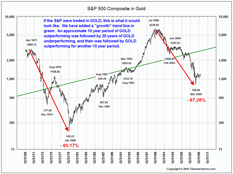
Compare a stock portfolio with a simple precious metals basket. The stock market is a poor longterm store of value.
It's very hard to stay ahead of inflation with securities whose value can be fudged by cheap money. In fact, pension funds can't even make +inflation guarantees, only best efforts through low-risk investments. And even if they did, they would be lying.
>Compare a stock portfolio with a simple precious metals basket. The stock market is a poor longterm store of value.
while I agree that this would make a very interesting chart, do you have a reference for that?
I mean it's clear that during the last 10 years, nothing has touched metals, but if you were in gold for the 10 years before that, things wouldn't have gone quite as well.
I think it's fairly obvious that there's a bubble in gold right now, and I would gleefully short it if I didn't suspect that the market will stay irrational longer than I can stay solvent...
I'm aware of some of the disadvantages; my understanding is that if I buy a Krugerrand, it appreciated (even if it's just keeping up with inflation) and I sell it, I need to pay a higher "collectors" tax rate rather than capital gains.
However, my understanding is that this is fairly easy to get around, either buy going for a ETF like GLD, buying stock in a company that owns gold 'in the ground'
Problem is, precious metals have an expected return of 0%. One gold bar sitting on a shelf is still one gold bar ten years later. Commodities are not necessarily a bad idea to own in moderation, but stocks and bonds are what allow your portfolio to benefit from economic growth.
For those who are enamored with gold and want to invest conservatively, I would look at something like the Permanent Portfolio (http://crawlingroad.com/blog/2008/12/22/permanent-portfolio-...) Not how I would invest personally, but the PP isn't an unreasonable approach.
This chart is pretty useless following the current world events. Right now stock market(US & EU) is supported by QE,QE1.5,QE2 and the next QEs. The tools that could be used to analyze the previous years are worthless.
I don't know, xtranormal seems to be chock full o' amazing financial advice. Here's one for you if you don't trust teddy bears: http://www.youtube.com/watch?v=jllJ-HeErjU
The best thing about this link is the "recommended video" in the big slot, "Piper Jaffray's Gene Munster Says Buy the Dip in Apple" submitted by "TradeTheTrend"
The premise of RWDWS is flawed by assuming that the secondary market in stocks is 'free'. This book was published in 1973, and after the 'analytic' schemes of the 1960s (and continuing in the 70s), it had obvious appeal. What it did not account for was government manipulation of financial markets through (de)regulation. For example, the Monetary Control Act of 1980 and the expansion of IRA coverage under ERTA in 1981 opened the flood gates to the securities markets and intensified the Ponzi-scheme nature of securities 'investing'. Prior to the publishing of RWDWS, it is reasonable to claim that the stock market was a arena for transferring risk, not pretending to be a savings institution. Something else to bear in mind is that there are little or no real alternatives to 'funds', and this exaggerates the influx of capital into them. The idealized view of stock and bond trading fails to fully account for the transaction costs, which are largely hidden, and this 'vigorish' makes it a losing game eventually. The costs associated with funds ('index' or otherwise) are also carefully and skillfully masked, but it is easier to market the diversification arguments. There's a reason that the 'financial industry' is so profitable: http://chartingtheeconomy.com/?p=665 It's an increasingly elaborate wealth transfer mechanism.
Returns on stocks do not compound. If you bought a stock at X and sold it at Y your gain/loss percentage is simply Y/X. There is no reason to use the Pert formula.
Actually, this is false. Printing USD is a tax on all current holders of USD - that is, it dilutes the value of all existing USD while raising money for the US government. Since there are large foreign holders of USD, but the US government can (theoretically) spend all of its USD on US citizens, printing money does in fact make us richer. This method of raising money is called seignorage, and it is how the US can tax the rest of the world to pay for whatever we want. We used it extensively during the Vietnam war to, in effect, make the French (large holders of USD at the time) pay for our war effort. They were not happy.
This says nothing of the long term effects of seniorage, just that printing money does, currently, make us richer.
Assuming that printing dollars results in a net transfer of wealth from foreigners ("them") to citizens ("us"), sure. But the "us" I was referring to was "people who hold or use U.S. Dollars" (or dollar-denominated assets).
Printing money is wealth transfer, straight up, in pretty much the same manner that an individual counterfeiter transfers wealth to himself.
These sums are paltry compared to the unprecedented quantities of wealth that have been transferred and continue to be transferred from the middle and lower classes to the elite of the finance and defense industries.
Aside from the wealth itself, there is a tremendous opportunity cost, since capital is moved from productive to outright destructive and criminal sectors of the economy.
The primary vehicle of these transfers is monetary expansion. All else being equal, a sound currency would bring orders of magnitude improvement in the real economy and dramatically increase standards of living for the bottom 90% of the population far beyond what can be achieved through programs like the ones you mention. Of course, there would be a deflationary collapse first, but this would be the best thing that could possibly happen for the vast majority of us.
Social security and medicare combined are 35% of the Federal budget. Income security is another 10%. National defense is 19%. Interest payments (essentially a transfer of wealth from taxpayers to T-bill holders, i.e. poor Americans to rich foreigners) are another 9%.
It's also not true, in strict monetary terms, that the vehicle of these transfers is monetary expansion. Total federal spending is about $3T. The total expansion in the monetary base since 2008, even with the massive explosion due to quantitative easing, is only $1.2T. Tax receipts still form the bulk of the budget.
I hate government waste as much as anyone, but get your facts straight before arguing.
I'll admit to not having great command of the statistics, but I don't see how the numbers you posted refute any of my points, and I don't appreciate your little quip of condescension at the end.
First, spending on social security, medicare, income security, and domestic programs is of a qualitatively different nature than military spending, bailouts, and the interest payments you mention in that it is inserted directly into the real economy instead of being diverted and for the most part removed for good. Yes, some small portion of the military budget really is for 'National Defense' and so would come closer to domestic spending, and perhaps some portion of the bailout funds wind up in the economy instead of banks in Zurich or Dubai, but the bulk of it is simply absconded. So you must strongly weight the impacts of these different types of expenditures in relation to each other to gauge their true comparative impacts, which you haven't addressed.
Second, the monetary base is only a small part of the picture since this only includes physical currency and highly liquid assets. $1.2T is an enormous expansion that constitutes a doubling of the base, but much more important are M3 and MZM since these include credit, which contributes exponentially more to inflation and wealth transfer due to fractional reserve banking, which is only possible on anything remotely close to this scale in a fiat system. This graph illustrates my point quite well, and it only shows up to M2, presumably since the Fed stopped reporting the even more damning statistics: http://en.wikipedia.org/wiki/File:Components_of_US_Money_sup.... So again you have ignored or confused critical factors.
The last point you left unaddressed is opportunity cost, which is really the core of my argument. In a sound economy with sufficient resources available, the capital stock (wealth) increases on an exponential scale, not linearly, because the more capital that exists, the more that can be invested in creating even more capital. Therefore, interfering with this process of accumulation through wealth transfers and the instability caused by monetary manipulations has deceptively gargantuan opportunity costs. All the resources that are funneled into bombs and guns are employed in actively destroying capital when they would otherwise be accelerating its accumulation. Likewise for resources funneled into estates, yachts, and private jets for finance industry billionaires that SHOULD have gone into producing capital goods for the real economy. If you truly consider the full consequences of these policies and the functional relationships involved, the implications are almost unbelievably staggering.
Printing money does, in fact, create wealth, in some limited contexts:
1. GDP growth requires printing money, or else it will create a deflationary environment, which is dangerous because it creates an incentive to delay business purchasing.
2. Low levels of inflation create a more efficient way for the economy to adjust the mix of labor skill demand. Research shows that it is difficult to nominally lower a worker's pay year over year, but giving no raise in an inflationary environment allows a company to do just that. This is important to lower the rewards for resources the economy has a lesser need for, such as when bar codes reduced the need for grocery store staff.
3. And finally, printing money can help an economy recover from an aggregate demand gap (i.e., a supply-demand disequilibrium that doesn't automatically recover). This can happen in period of high unemployment, where wages need to fall to create more demand for labor, but a fall in wages reduces personal income, further reducing aggregate demand, further reducing the demand for labor. Printing money reduces the cost of money and gives an incentive for companies to invest more, which reduces the aggregate demand gap.
You're arguing that printing money reallocates wealth, which it certainly does. But it does not create wealth. New dollars created from thin air do not also magically call into existence new goods and services. It's simply more dollars chasing the same goods and services.
Either that, or counterfeiters also create wealth.
With all due respect, you do not appear to have understood my reply.
I specifically state that it does, in certain situations, create wealth. There is a tremendous amount of economic research to support this.
Of course, I agree with you that printing money does not always create wealth. Far from it. There are many cases in which it does not create wealth. Highly inflationary economies are a good example of this.
But if you re-read the three situations I describe, you will see that they do indeed describe places that the printing of money will create wealth that would not have existed otherwise without the printing of money, and which are above and beyond the mere reallocation of wealth.
Perhaps to better understand why your point is not true is to understand your claim from a different perspective: that the money supply should always stay exactly constant, year after year.
Even a cursory understanding of my first point (that economic growth in and of itself requires a corresponding increase in the money supply) shows this to not be true. Imagine the economy grows and the money supply stays constant. The value of products available per dollar now increases annually. This is deflation.
Now you are implicitly claiming that deflation is a good thing.
Your entire argument boils down to casting deflation as a boogie man. Prices decreasing is a GOOD thing. It allows you to afford more and better stuff. Exhibit A: the consumer electronics industry.
Yes, deflationary collapses that are preceded by artificially induced inflationary booms cause massive pain. This is why we shouldn't have artificially induced inflationary booms. They massively misdirect resources and create a necessity for a massive restructuring, which is painful and destabilizing, but necessary and inevitable to return to economic viability. You are confusing the heroin with the withdrawal, the alcohol with the hangover, the sickness with the cure.
This is what it looks after shifting all the colors one step towards green:
http://imgur.com/KqU1B